Antle teaches information design (Structuring Content lecture)
Structuring Content
Lecture outline
Thinking about layout and structure to direct movement through content. Lecture slides will be made available on the day of the lecture (September 17).
In preparation for lecture...
Please close up any laptops, cellphones, PlayStations, Nokia Communicators and other 'beep-boop' devices.
Structuring content
Critique
Critique is a communication skill. Effective critique requires reading/listening, responding, and practice.
Effective critique is...
Purposeful: Has a clear statement or goal.
Specific: Identifies a particular strength/weakness (not speaking in generalities).
Language appropriate: Uses language understood by the audience.
Practical/action-oriented: There is something to do or think about.
Timely: The type of feedback given makes sense for the stage of work.
Critique context
Before giving critique, it is always important that you understand what the project is, and where it is at. This helps ensure your feedback will be timely and purposeful.
Today's critique
Our approach
We will be taking the 'I like/I wish' approach for today's critique: Please start each critique with either 'I like' or 'I wish'.
Good content structure helps direct and guide a viewer through the content actively. We are going to recap a number of design fundamentals that help us build better structures.
Gestalt
Next in our order of cognition
A psychological theory that our minds self-organize disparate elements into a unified whole. Gestalt theory offers us tools for building meaningful visual relationships.
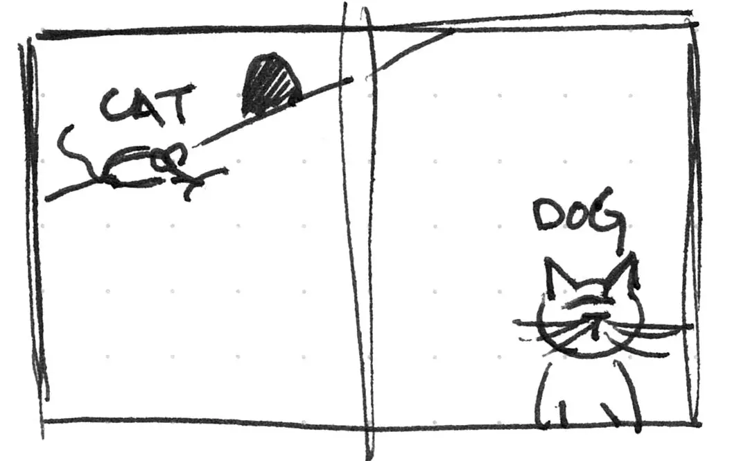
Proximity
Gestalt theory
Things that are closer are more related.
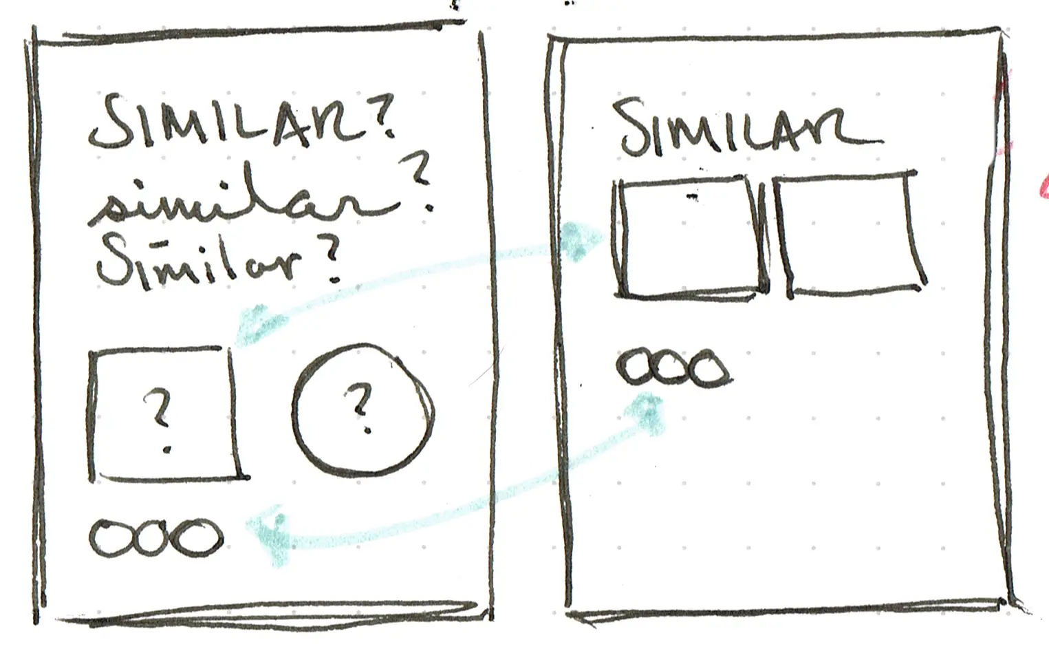
Similarity
Gestalt theory
Things that are similar are more related.
Continuance
Gestalt theory
We will build relationships between things that track along an expected line.
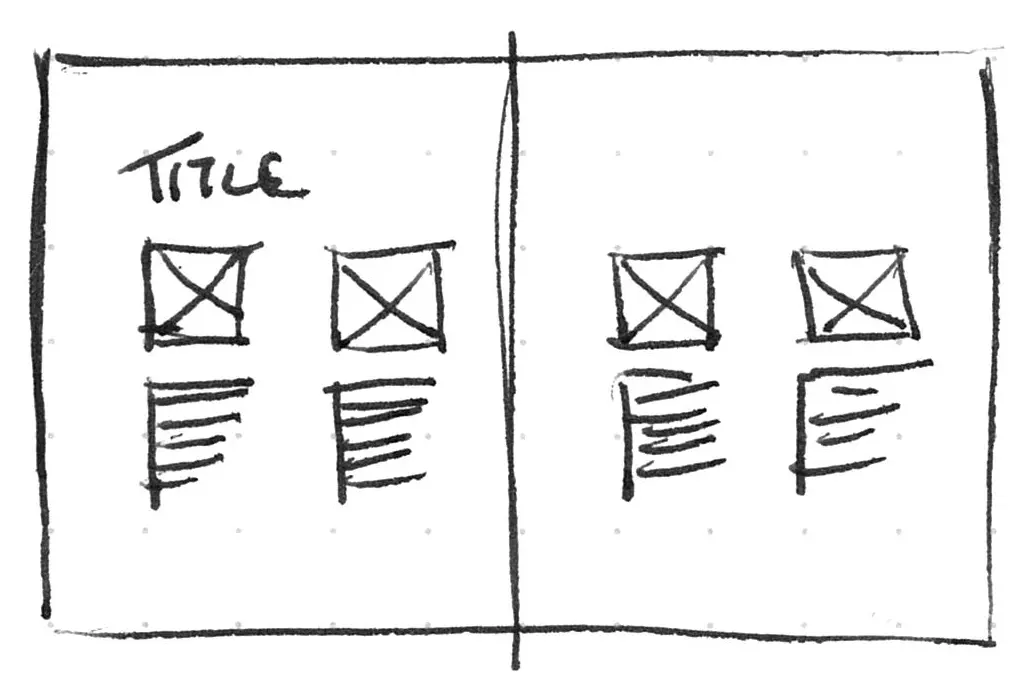
Space
Design practice
Helps to clarify relationships and direct attention.
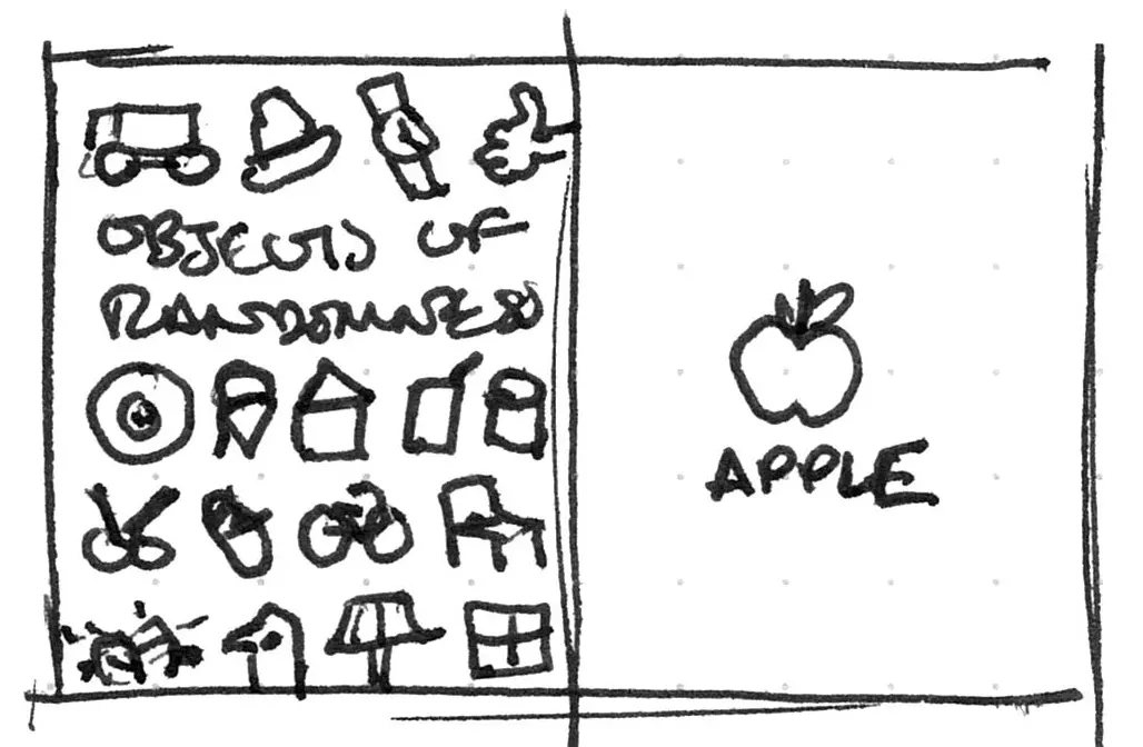
We want our content to focused on what the user needs or understands.
Keep content concise
Users are going to scan through content to find what they want or need. Provide them with concise and well-structured content to help them.
Interfaces are type
"It is the typographer's task to divide up and organize and interpret this mass of printed matter in such a way that the reader will have a good chance of finding what is of interest to [them]."
Emil Ruder
To Figma!
Let's get you ready for continuing working on P1 with a tutorial covering: